

By Bowen Hobbs
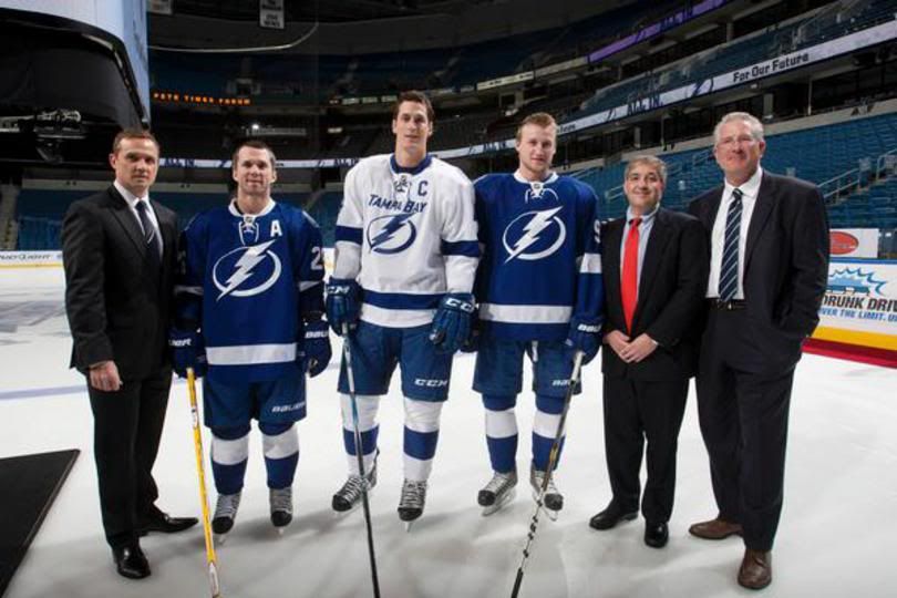
After multiple delays in the unveiling of their new brand, as well as the fact that teams don't generally unveil new branding initiatives during the season. The new 2011-12 Tampa Bay Lightning brand is here. And quite frankly, one word pretty much covers it: meh.
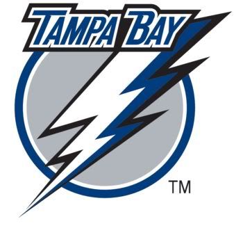
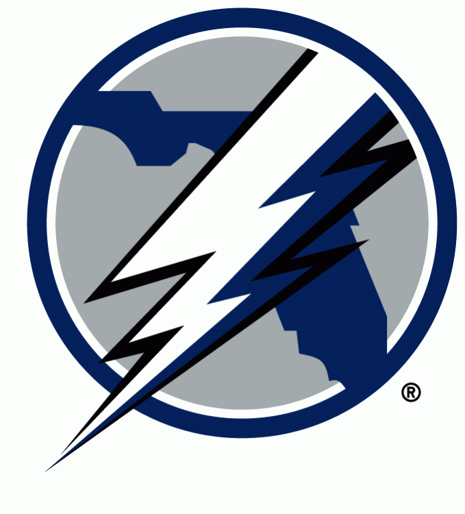
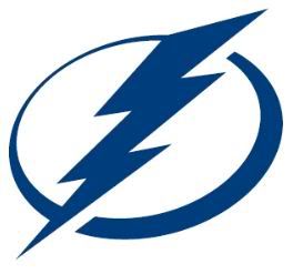
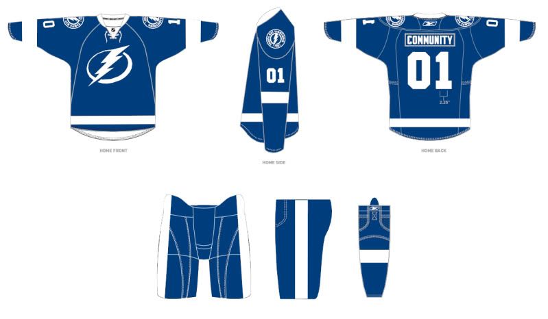
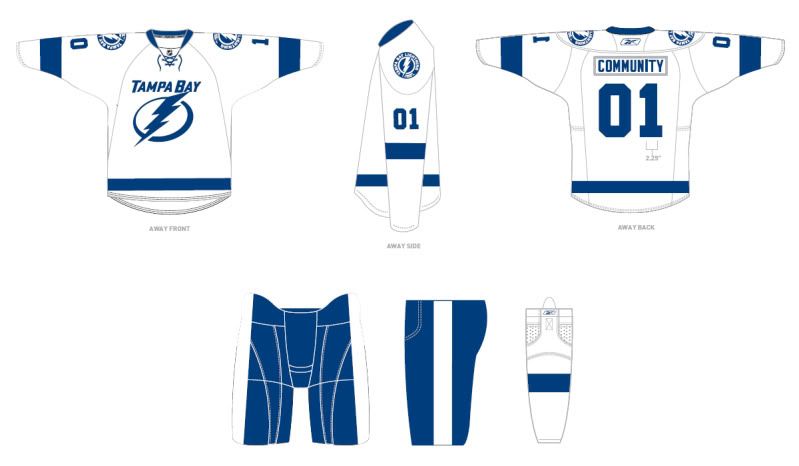
The team's current (soon to be former) primary logo wasn't perfect. In fact, some would say it was over-stylized. The wordmark is unnecessary, and it contained four colors, which may be a lot for traditionalists although many modern designs use that many colors. The alternate logo really wasn't any better. The saying I like to use to describe it is that "it looks like 10 lbs. of design crammed into a 5-lb. bag". The new logo set, however is a stark contrast. The new primary logo features a lightning bolt against a stylized oval. The team's brass wanted iconic. And if this design existed in a vacuum, it would be. But, unfortunately, they couldn't agree on a single icon. The alternate logo adds a wordmark, and the shoulder patch uses a different lightning bolt/holding shape combination. Once again, the primary logo is strong on its own, but some consistency throughout the set would be ideal.
But before we get into the rest of the logo set, let's talk about the elephant in the room: the color scheme. I realize there are teams with the same colors in multiple leagues. Look no further than MLB, for example. How many teams wear navy and red? Too many. And in the NBA, the Nuggets, Mavericks, Grizzlies, and Thunder all wear two shades of blue. The NFL isn't immune either, as the Cardinals and Falcons have their similarities, and Carolina's alternate uniforms look a lot like the Lions' homes. But this goes too far. The Leafs have been a beacon of royal and white in hockey since the NHL since 1927. They have also featured a simple hem striping scheme for a number of years. Then Tampa Bay comes in having only been a team for less than 20 years, and plays a game of copycat? Really?!? I thought the point of branding was to create your own identity, not piggyback off of someone else's.
And the Lightning had a unique color scheme. No one else had black and blue. Once again, I'm not saying it was the best, but it was unique. Even if the new brass (which includes Stevie Y, hence the minimalist influence) didn't want to use black and blue, how about royal and silver? Replace all the white on the home jersey and some of the white on the away jerseys, and you have a unique set of uniforms in the context of the NHL.
Back to the primary logo: while it isn't terrible, I think the circle and bolt from the tertiary would create a stronger mark with a better tie-in to the Lightning's past. In fact, putting the text and circle around that symbol was the worst thing they probably could have done for it, as it looks like they were taking design tips from the Omaha Storm Chasers. Furthermore, the generic typeface goes past understated (which can be achieved with the correct typeface) into the world of boring, generic, and default. Not to mention the generic typeface doesn't match the typeface of…
The secondary is a joke. I think everyone who watches hockey is going to know who the Maple Leaf wannabes are. And those who don't follow hockey will probably just assume it's Toronto they're seeing. They could have created a TB logo, but they decided not to.
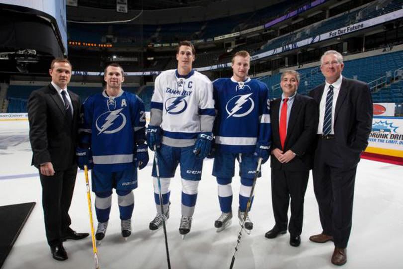
As for the uniforms, they use the same single broad stripe pattern as the Red Wings' home uniforms, although the pattern is pretty common overall. And you'd think they would look for a more original design considering the Leafs use a double stripe that is positioned in the same classic hockey pattern. Here are the graphic layouts of home and road for the new Bolts set. As you can see on the layouts, in addition to using two different typefaces on the logo set, the numbers are a third typeface, and it's standard block (the Arial of jersey numbers). In addition, they traded in the one of two original things from their previous uniforms for the generic version on their breezers. They also ditched the victory stripes (look at the armpit of the guy on the right of the previous linked photo).
As I've hinted at, one of the biggest concerns with this set is context. The aesthetic of the new brand is so strikingly Leafs, it can't go without saying. And of course it follows the recent onslaught of blue jerseys with lace-up collars, despite an oval-shaped crest being used instead of a roundel. The new set clearly states, "We're individuals, just like everybody else."
The other huge issue is based on direction. Obviously the team tried very hard to incorporate classic elements into the scheme. Things like a one-color (plus white) scheme, lace-up collar, and round alternate logo all evoke ideas of classic hockey. Then why is the primary logo so starkly modern? And why is the typeface on the "secondary" italicized and stylized? But those two questions are unimportant compareed to the next one: What is so classic about playing a winter sport that needs ice in the middle of Florida? It's not like an expansion team ended up in Milwaukee, where a traditional style could evoke a Winter Classic-like atmosphere. It's Tampa, where sunshine is in abundance. But even that issue could be worked around if the presentation of the brand were more consistently traditional. Instead, they only went halfway and that just isn't enough to make me forget that it's a hockey team in Florida.
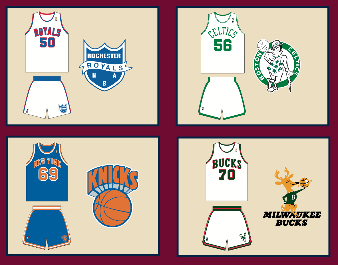
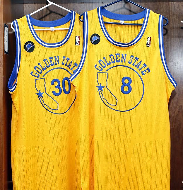
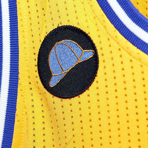
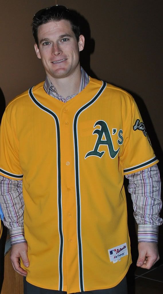
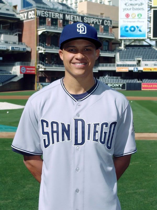
In Other News… The Oklahoma Sooners will have new baseball uniforms in 2011… New logo for the Ryder Cup… If you design a logo for it, they will come… It's Hardwood Classics month in the NBA, complete with throwback uniforms for the Bucks, Kings, Knicks, Celtics and Warriors. The Warriors jersey even has a memorial patch for Franklin Mieuli… Thanks Tiki Barber, for teaching me what the Green Bay Packers G stands for… The Los Angeles Angels of Anaheim will have "Flashback Fridays" this season for their 50th Anniversary… The Lakers wore throwbacks Sunday against the Celtics… The Oakland finally unveiled their poorly kept secret: athletic gold jerseys… The Mariners will have a memorial patch for broadcaster Dave Niehaus this season… The Padres finally released the look of their road uniforms for 2011. Needless to say, they removed all traces of originality…
Designer's Corner
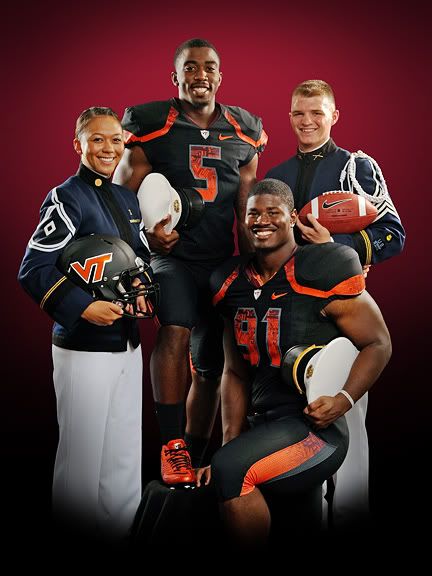
This week's design is for the Virginia Tech Hokies. The Hokies' current logo features a stylized VT. I took that idea and added a distinction between the two letters. I also included a segmented gradiation to emphasize the speed that VT displays on the field. Using the proportions of the primary mark, I developed a wordmark for the school, as well as custom numbers. For the uniforms, I drew a lot of inspiration from the Hokies' 2010 Pro Combat uniforms. I really like the way the shoulders were cropped on those jerseys. However, I did not care for the use of black because VT has one of the most unique color combinations in all of sports. The jersey accents fade as they approach the collar, while the accents on the pants fade as they reach the waist. I have also included options for orange jerseys, white and maroon helmets, and all three colors of pants.


Feel free to leave a comment regarding the new Tampa Bay Lightning brand, the Virginia Tech design above, or anything sports branding related.
If you are looking for Girl Baseball Uniforms? We can help you, You came and visit my site and let the experts help you outfit your Girl Baseball teams in the most vibrant color combinations, as well as incorporate sponsors' logos into the designs.
ReplyDeleteGirl Baseball Uniforms
What program do you use to create these uniform combos?
ReplyDelete